Good interfaces do not remove complexity. They help people move through it.
SALT Royalties is a SaaS platform developed by STAGE to help collection societies and music publishers manage the royalty pipeline: processing usage data from digital services, matching recordings to musical works and supporting accurate royalty distribution.
I joined early in its development and worked as UI Lead and Senior Frontend Engineer from December 2021 until my maternity leave in February 2026. My role combined front-end technical direction, hands-on implementation and UI/UX work, in close collaboration with product, engineering, QA and client teams.
The underlying process varies across royalty streams, countries, societies and rights models. The challenge was to accommodate that nuance while keeping the information readable and the workflows consistent.
Complexity made understandable
Music royalties are complex. The work focused on presenting that complexity clearly, helping users understand where they were, what they were looking at and what needed to happen next.
Consistent patterns, careful hierarchy and clear system feedback helped users work with large amounts of information without having to relearn the interface from one area of the product to another.
From individual records to the wider picture
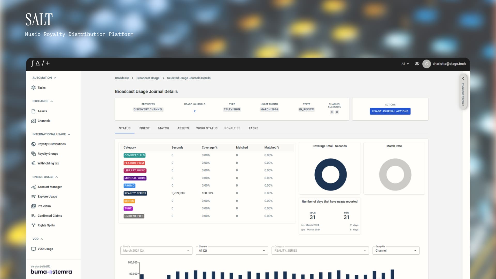
Users also need to understand the state of a whole usage journal. The dashboard combines a detailed category breakdown with visual summaries of coverage and matching progress, helping them see how reported usage is distributed and what still needs attention.
The table provides precise values, while the charts offer a quicker overview. Keeping both within the same view supports different levels of inspection without separating the summary from its underlying detail.
A closer look at matching
A recording and a musical work are different entities. Matching connects usage of a recording to the correct underlying work, so the platform can identify the relevant rights holders.
Users need to assess more than a similar title. Artist and creator names, identifiers, alternative titles and candidate scores all contribute to a decision. The interface had to make that evidence easy to compare while supporting repeated decisions throughout the day.
Find the records that need attention
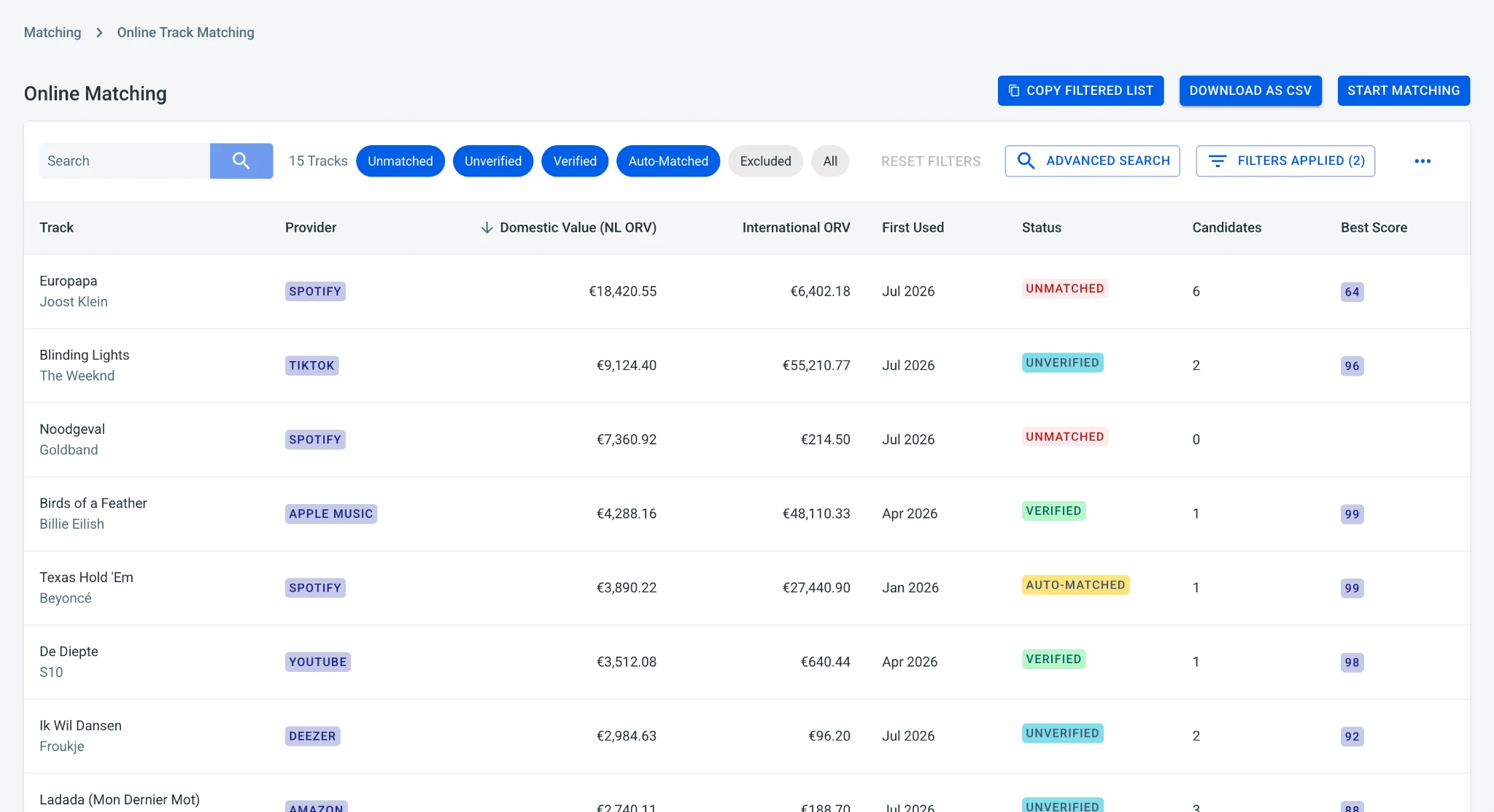
The matching queue brings status, candidate counts, scores and royalty values together.
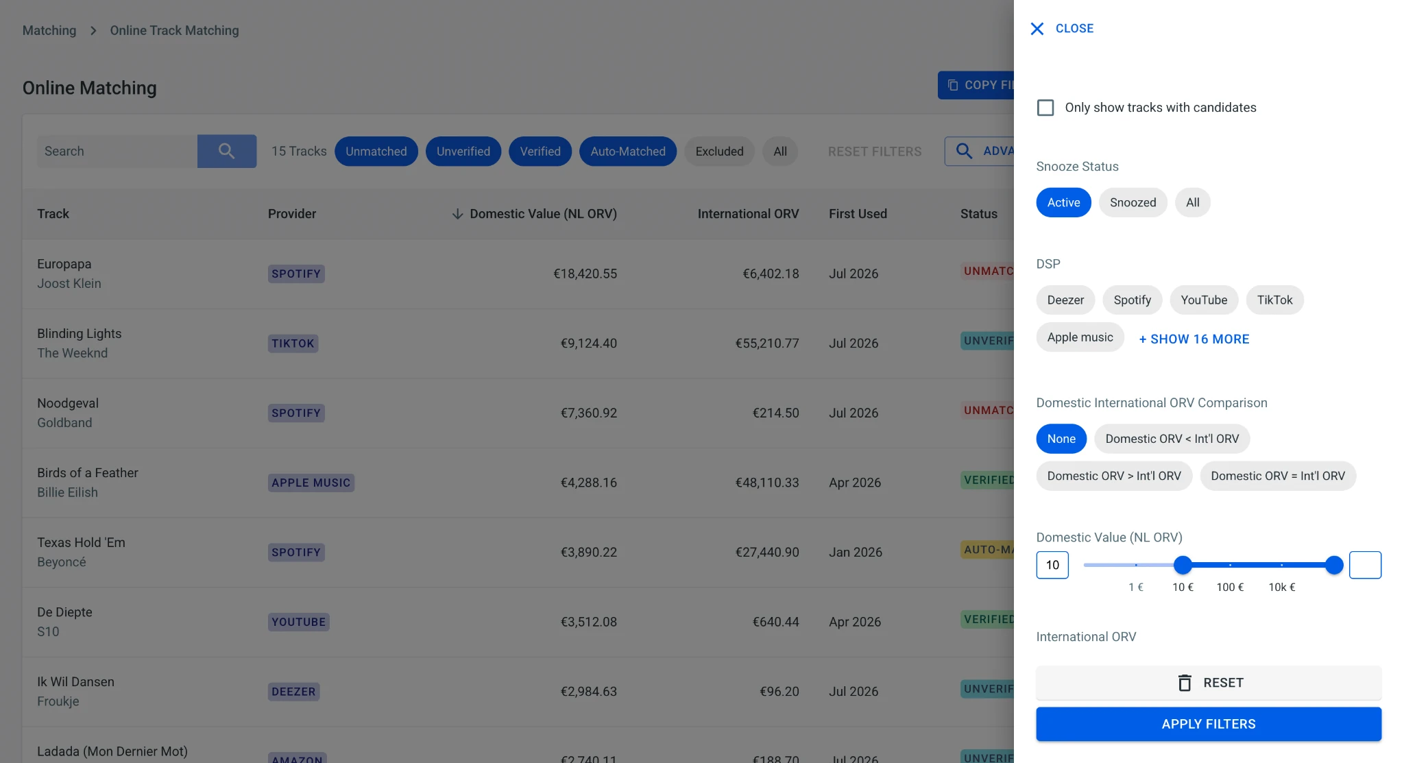
Search and filters help users narrow that list.
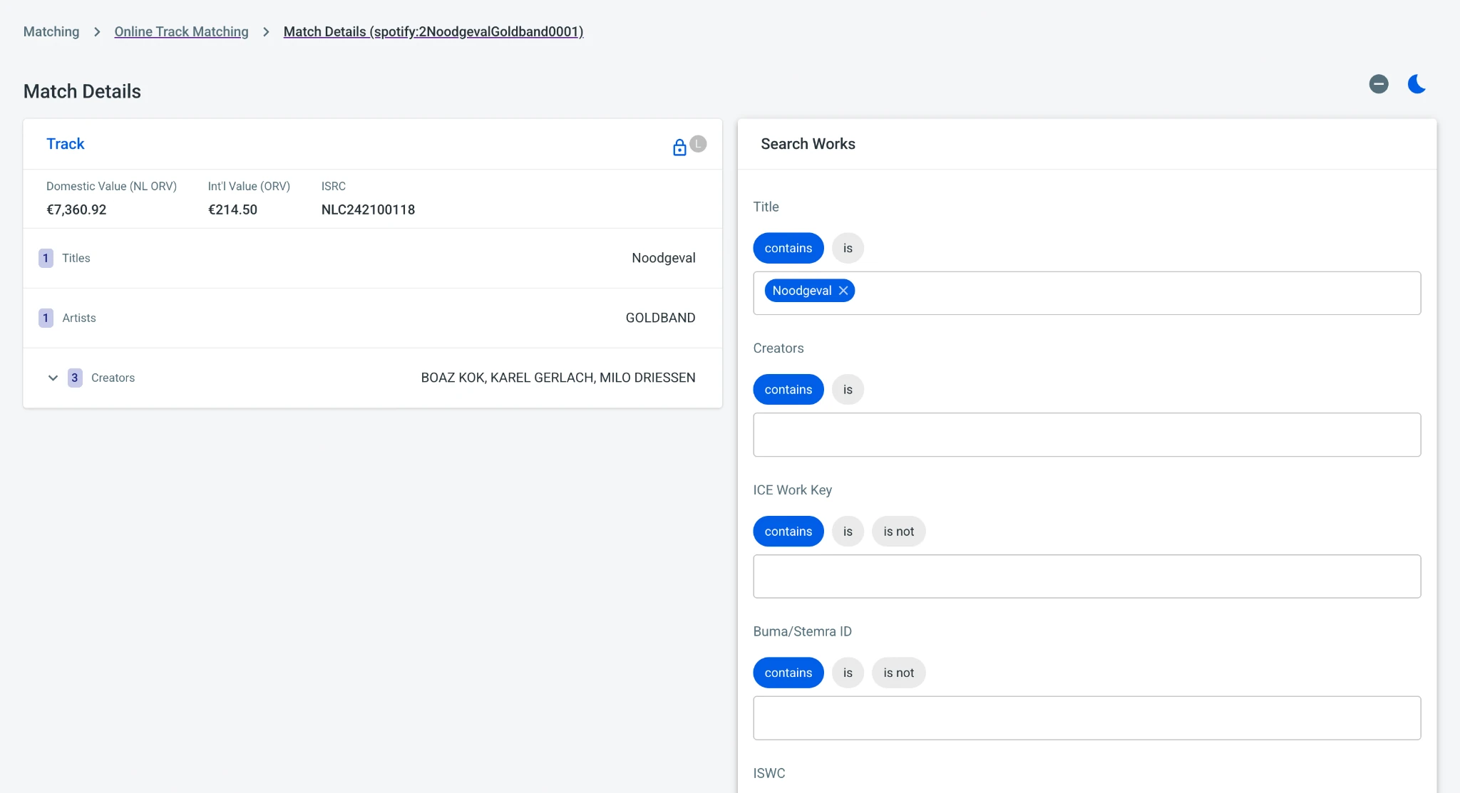
From an individual record, search can also look up a work by title, creator or identifier when a suitable candidate is not already suggested.
Compare evidence side by side
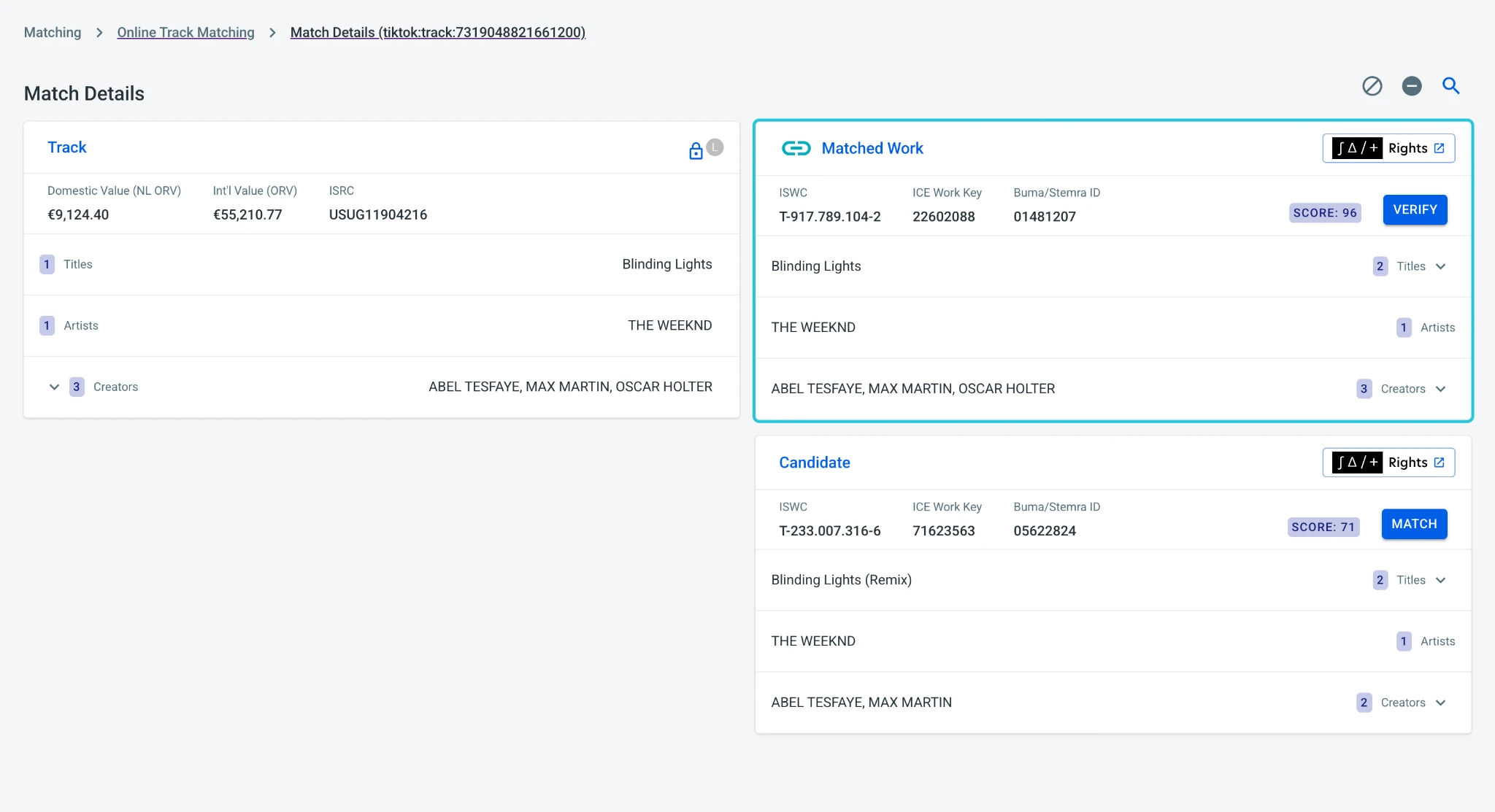
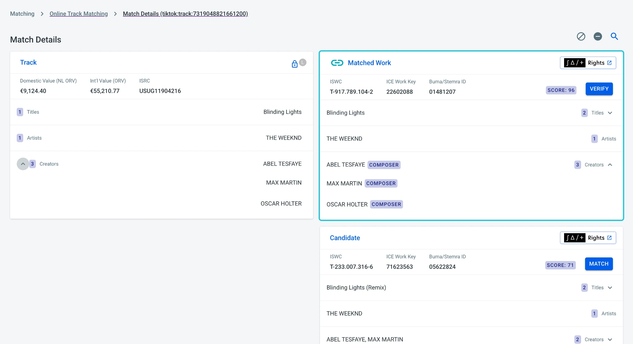
The source track sits on the left, with candidate works on the right. Titles, artists and creators follow a consistent row structure so users can compare equivalent information across the two cards.
Expandable lists reveal additional metadata when needed. Counts indicate that more information is available, while the collapsed view keeps the initial comparison compact. Candidate scores provide another signal alongside the underlying metadata.
Keep context close to the decision
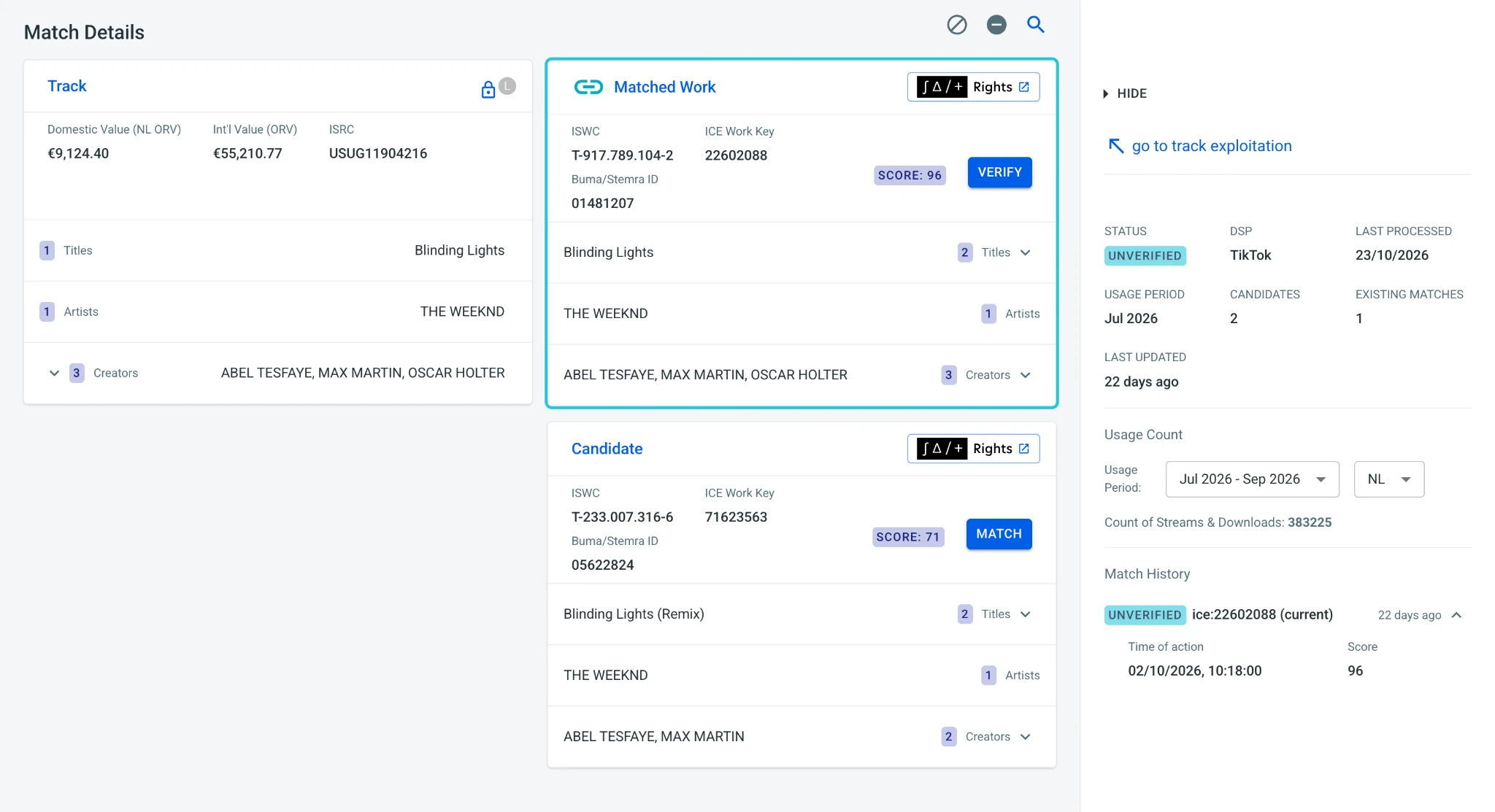
A supporting panel provides track context, including processing information and existing matches.
Audio playback gives users another way to check the recording while keeping the source and matched work visible.
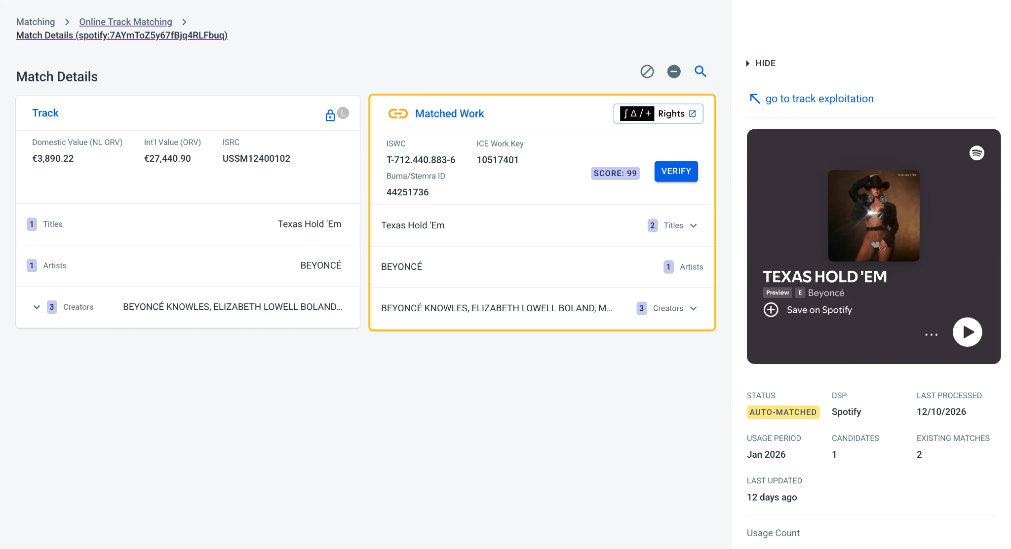
The matching screen became a feature clients responded well to in demonstrations. For me, it is a clear example of how interface design and front-end implementation work together: hierarchy, alignment and interactive behaviour all contribute to making a dense task easier to navigate.
Building for growth
SALT Royalties began with one society and expanded to support organisations in multiple countries. The product could no longer rely on solutions shaped around a single client's workflow.
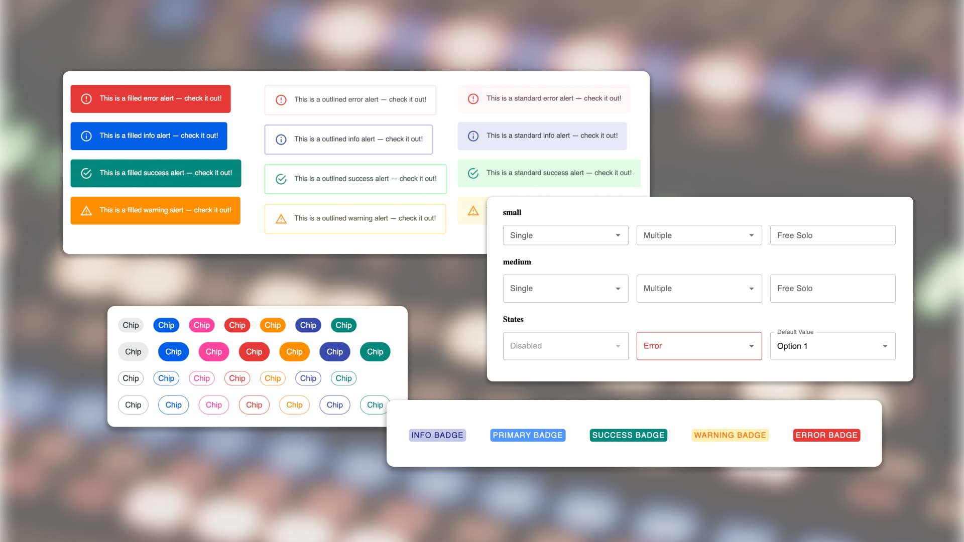
This required a shift from solving individual screens to creating systems. Reusable patterns and shared behaviours provided a foundation for new features without making each organisation's experience feel like a separate product.
I proposed and led a migration to microfrontends, delivered without downtime. This enabled teams to deploy independently and supported client-specific combinations of modules. Across my time at STAGE, I worked across roughly five teams and led front-end technical direction for a team averaging five engineers.
Principles in practice
Design for systems, not screens
Individual screens change as a product grows. New work should strengthen reusable patterns rather than introduce another exception.
Make the evidence readable
The interface should organise domain complexity so that users can understand it and act on it. In matching, that meant bringing related metadata into a consistent comparison structure.
Consistency builds confidence
Predictable behaviour lets users focus on royalties rather than the software. Shared patterns reduce uncertainty across many pages, processes and states.
Design continues through implementation
Design decisions need to hold up in working software. Collaboration with engineering, QA and client teams helped refine the interface as requirements and edge cases emerged.
Design as collaboration
I led regular UI workshops to explore problems collectively before committing to solutions, bringing together domain knowledge, technical constraints and different perspectives. An on-site workshop in Amsterdam also informed the matching workflow through direct discussion with users.
I worked closely with QA to build a scalable testing approach using Playwright, with early failure checks in CI and tests that could run without the backend. This helped the team identify problems earlier in delivery.
My wider contribution included co-leading translations across the application, building a publishing workflow with AWS CDK and creating reporting dashboards for client-facing teams.
Reflection
SALT changed the way I think about interfaces.
Some of the most valuable improvements came from stepping back and reconsidering patterns that affected many features. The matching workflow brought that lesson into focus: making a complex task clearer depended on the structure of the comparison as much as the appearance of each card.
It also reinforced the value of working across design and engineering. The interaction only succeeds when its hierarchy, behaviour and implementation support the same task.